Verizon: HUM
Overview
HUM by Verizon is a system designed to make your car smarter, safer, and more connected. The new addition HUM-X provides an emergency crash response, roadside assistance, vehicle diagnostics, and more. In addition, we were tasked to integrate the microsite www.hum.com into Verizon’s website to better inform and educate both new and current customers about the product.
Role
UX/UI Designer (User Research, Visual Design, Prototyping & Testing)
Tools
Sketch, InVision, Adobe Photoshop & Illustrator
Platform
Desktop
Stakeholder Interview
From the initial stakeholder meetings, we identified the key project goals and outlined the project’s timeline to meet a 4 weeks deadline.
Business Goals:
Introduce new product offering of HUM-X and the added feature of WiFi to motivate purchase through verizon.com.
Provide a simplified overview of HUM by communicating the overarching position and top features to those unaware or who need additional support/education before purchasing.
User Experience Goals:
The design should integrate features from the microsite with Verizon’s brand message and values to appeal to current and new HUM customers.
Develop a compelling content strategy around purchasing options to meet Verizon’s business goals while establishing trust between the brand and car owners.
Comparative Layout Analysis
To identify HUM's new design opportunities while aligning with Verizon’s brand, I conducted a comparative layout analysis of our three competitors’ websites: Automatic, Vinli, and Zubie. We took inspiration from Automatic’s direct and clean messaging strategy and Vinli’s visually engaging content, particularly their app's compelling storytelling, to breathe life into our site designs.
Understanding Our Users
Our primary design goal is to understand the hierarchy of information that the user looks for when they are shopping for the best car diagnostic adapters.
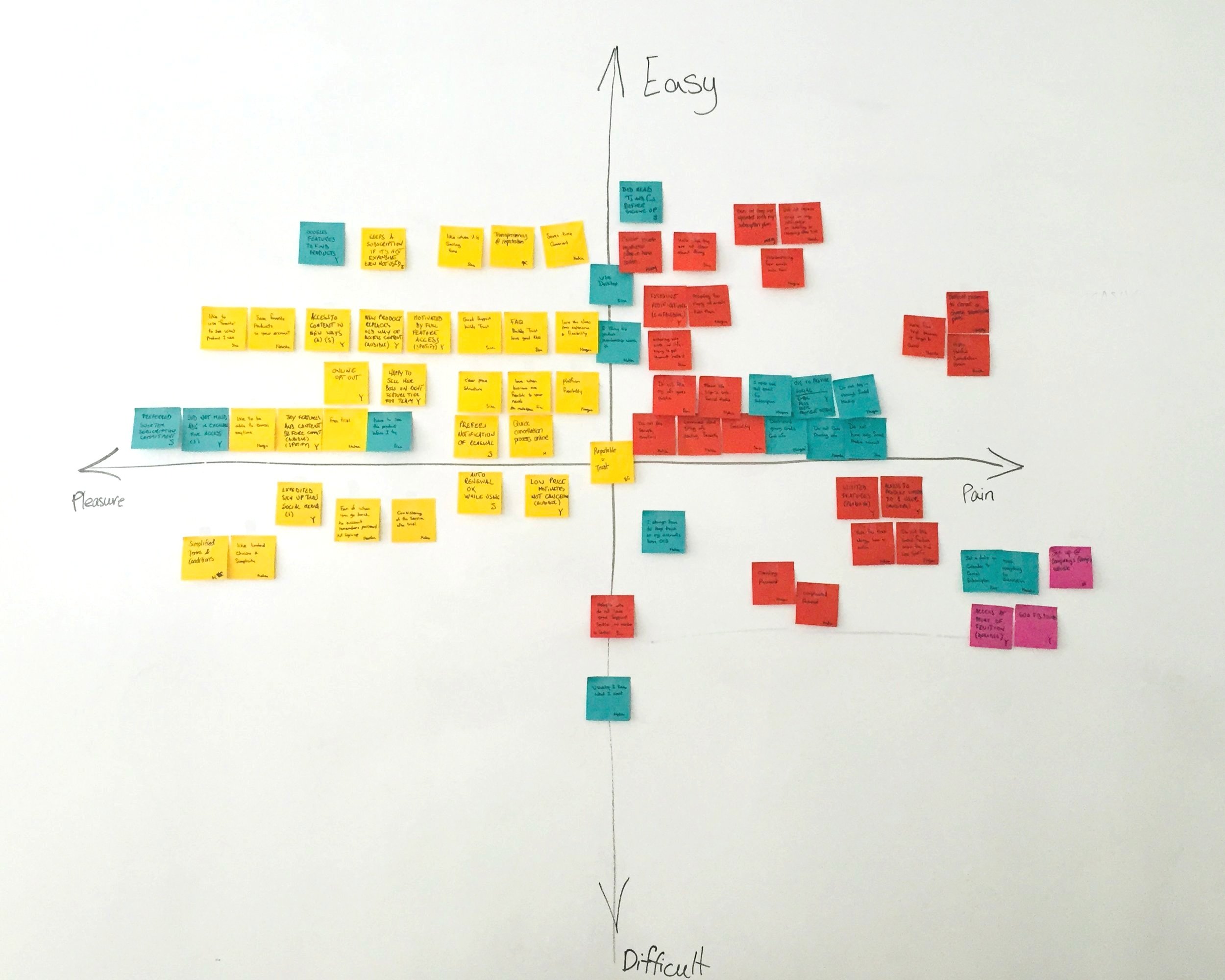
After conducting 15 user interviews, our team analyzed our user data by affinity mapping our findings into pain, pleasures, difficult, and easy to identify similarities and trends. Many users were frustrated when they need to watch videos to learn about the product and favored the ability to compare similar products side by side. These findings emphasized that a user needs to design a comparison tool feature and a mobile-friendly responsive design.
Personas
Our affinity mapping has allowed us to gather key features and discover commonalities of our users, which informed us of creating our 3 personas. They are an essential point-of-reference tool on the feature prioritization process, which has helped us identify our “must-have” features:
Ability to toggle between HUM+ and HUM-X to view and compare features without leaving the page.
Balance of visually appealing and informative content educates the user of the benefits of the product without overwhelming their decision-making process.
Design Evolution
Following a design studio with the team, we transitioned our sketches into wireframes and created a web and mobile prototype to begin our usability tests. This quickly led us to discover design flaws such as confusion in accessing information between the two products on the same page. This early discovery allowed us to iterate on our designs for further testing.
Our primary point of refinement was our decision to consolidate the 15 product features into an accordion-style for both platforms, which ultimately prioritized the content and increased user engagement.
HUM’s Official New Landing Page (Launched April 2017)
Results and Takeaways
Since the implementation of the new HUM landing page on Verizon’s website, we have seen a significant increase in the number of people who spend their time looking at the product page and 35% of those who have signed up for the product the first quarter. Additionally, we have received positive feedback from customers about the page's clean structure, which saved them a large proportion of their time from deciding which product was the perfect fit for their vehicle needs.
Some key takeaways from this project include:
Involve content editors and developers upfront. Understanding the technical limitations and content that goes in upfront helps inform our design strategies and reduce any rework after delivery.
User testing does not end after development. Technology is constantly evolving around us so we should always find ways to listen to user feedback and iterate on our designs to improve on the user experience.


