American Express: Plenti
Overview
In recent years, there has been a growing trend of people seeking the best way to save on their purchases. Many stores have created their own loyalty programs to entice people to shop more by simply offering discounts and points as an incentive. But with so many loyalty rewards programs, customers can get overwhelmed by tracking every single one of them. Plenti was eventually born; a loyalty rewards program that promises to bring order to chaos by combining all your loyalty programs and the points you earn from hundreds of retailers into one.
Role
UX/UI Designer (User Research, Interaction Design, Visual Design, Prototyping & Testing)
Tools
Sketch, InVision, Adobe Photoshop & Illustrator
Platform
Desktop & Mobile (iOS, Android)
the problem
Despite Plenti’s promises, many users are confused as to how Plenti differentiates from the loyalty reward programs that they’ve already joined, So we asked ourselves: How can we clearly translate and simplify our message for the users across the entire web and mobile app?
The opportunity
Revisit past usability testing results and research users’ responses through social media to unearth the most common pain points. Restructure the entire mobile app from scratch to create a more visually appealing and user-friendly app that users of all generations can use.
Customer Insights
Starting with the past usability research findings, I created an end-to-end customer journey to better visualize the happy path flow that most of our customer takes:
Next, I dived into a usability test that was conducted in September 2013 where 12 participants (8 women/4 men) actively engaged in loyalty programs was given a homework assignment to record their shopping behaviors a week before the testing session. The purpose of this test was to understand how participants feel toward rewards/loyalty programs and the Plenti app.
The results revealed their “little wins” when they shop with rewards/loyalty programs:
Furthermore, when the participants tested the Plenti app, they understood what it is and how it works, which resulted in favorable reactions such as “I love it! Sign me up!” and “I’m not a coupon clipper. However, this is a great alternative. I can earn points; there’s a value.” Overall, the participants were able to navigate through the Browse Offers section of the app and understood the green checkmark icon meant the offer was activated.
However, a host of questions from participants remained. It was clear that participants needed to be educated about Plenti (in particular, how it works):
“What happens to the points I’ve already earned at each store?”
“How do I track the points I have already earned?”
“How much are the points worth?”
and had their expectations about getting started in the program:
“I assume I’d have to sign up first, give them lots of information about me.”
“I imagined I’d be able to see a list of all the stores that are a part of it.”
“You’d probably have to upload all your cards before you can do anything else, right?”
competitive analysis
It was equally important to research other rewards/loyalty programs as their solutions to similar problems will help me gather insights into their strengths and weaknesses, which will help me refine my designs. I analyzed four competitors, and 3 of them had a transparent points system that translated earned points into actual dollar amounts, which helped users make an informed spending decision.
Qualitative Persona
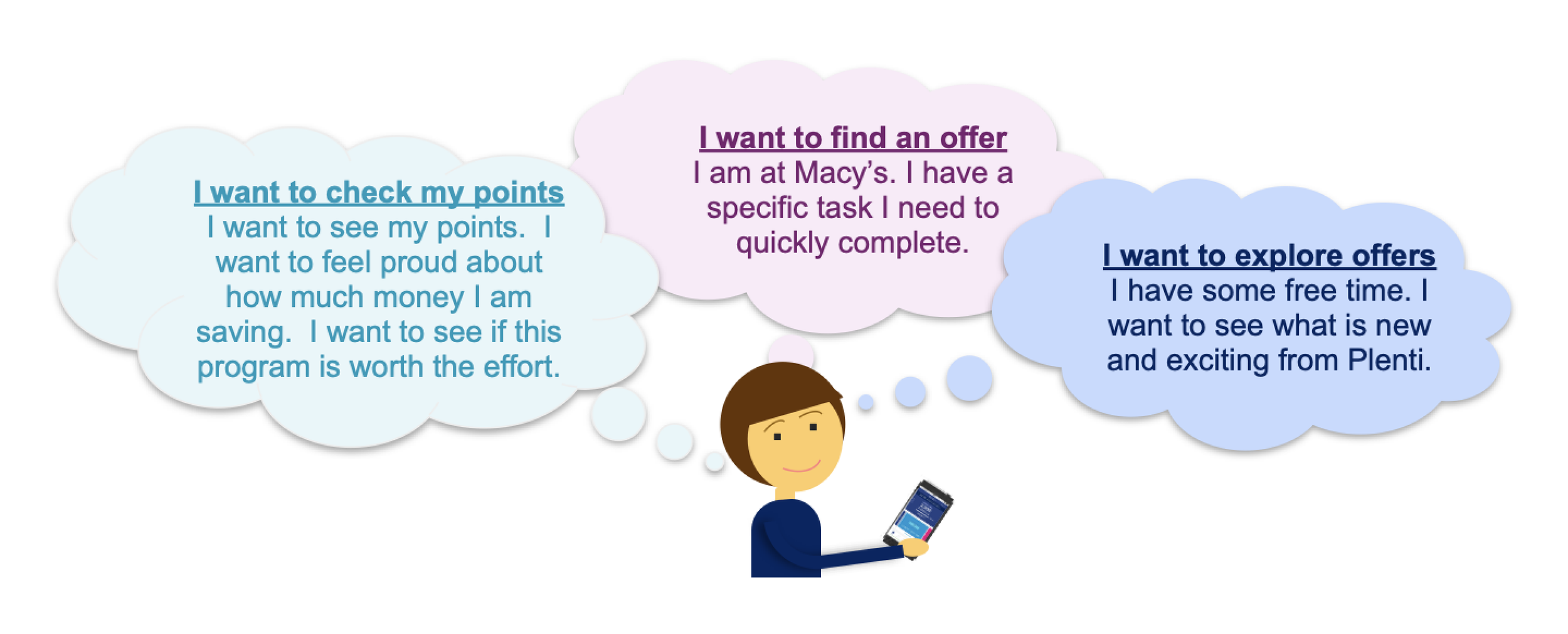
Based on the past research, we recognized three key user types that our product tried to solve problems for, and we decided to focus on Bridget because she is the embodiment of all the key users.
CONCEPTUALIZING & testing
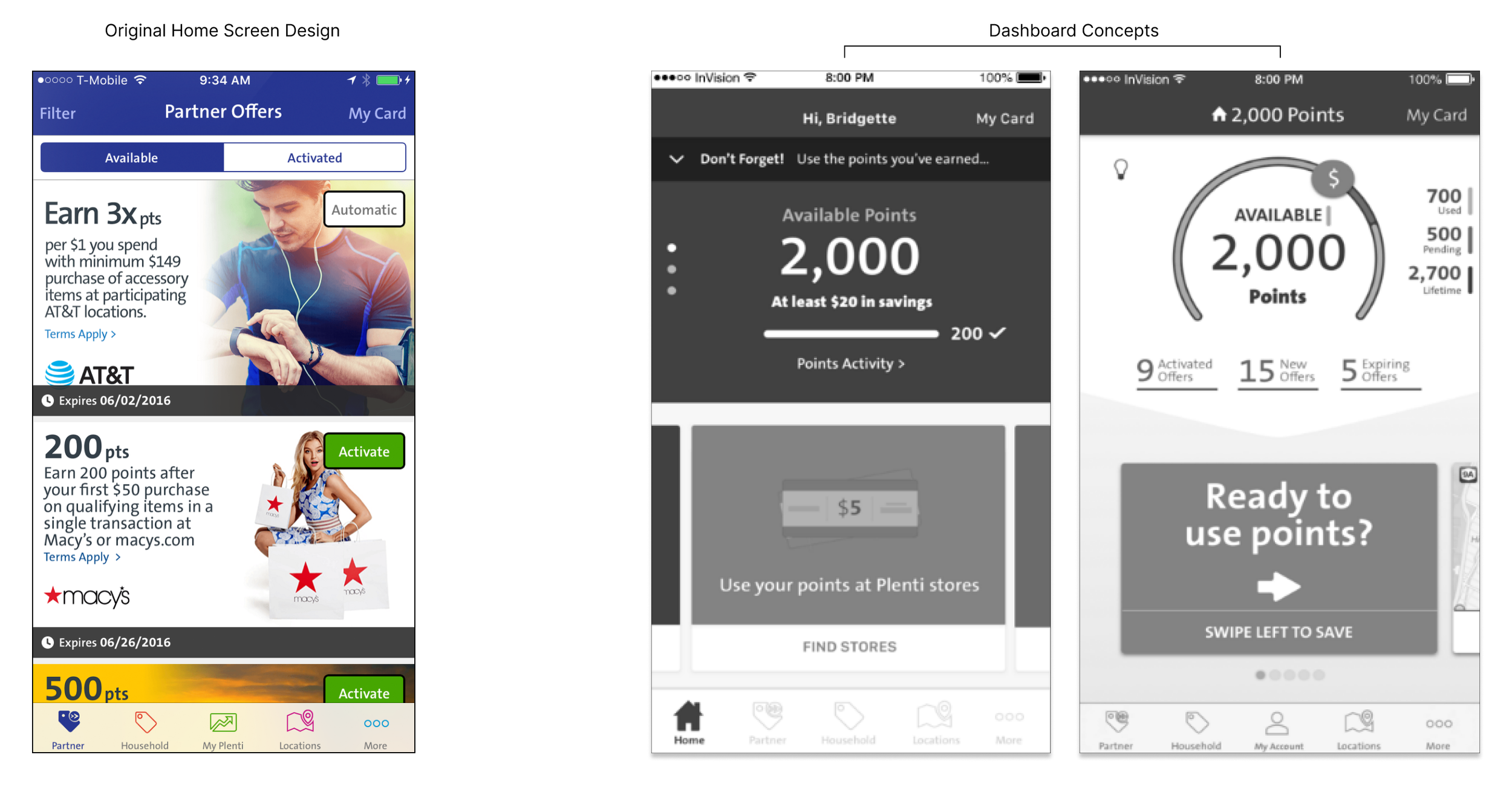
Our team conducted a design studio to brainstorm ways to display the user’s reward points and offers with the past usability research findings and persona in mind. In Plenti’s business model, the primary focus is on customers actively using offers and points to shop at participating brands. However, the current design of the home screen only encourages users to activate available offers with no incentives to start using them. And most importantly, since this is the screen users first see when they log in, we need to provide the users with a simple but engaging way to understand their progress towards earning rewards and using the offers.
Simplifying the Display of Reward Points
The majority of our users mentioned that checking their current point balance is one of the primary reasons for logging into the Plenti app. But the current navigation to find the point balance is a hassle. So in my first design exploration, I researched and designed different tracker designs that can translate points to look more visually appealing and easier to understand. Through usability testing, our participants had a positive reaction to seeing their points information upfront and expressed their desire to earn more points. However, both designs are not intuitive about how much money they are saving, and they prefer seeing points to dollar conversion without having to calculate manually.
Reshaping the Hierarchy of Information
Our users primarily focus on the brand and how many points they can earn when browsing through offers. However, in the original offer tile design, the content was overwhelming, and as a result, many users started to lose focus and interest in finding an offer. For the redesign, I broke down the offer tile into sections and rearranged the information hierarchy based on what our users prioritize first. I also worked with our content editor to restructure the content. Through several user testings, our users preferred the redesigned offer tiles as. The visual design brings essential information to the forefront and is less text-heavy.
Overall, our users have a positive reaction to the idea of a dashboard in the Plenti app. They appreciate the idea of the dashboard because it allows them to quickly start key tasks including:
Check Plenti Point Balance
Find Offers / Explore Offers
Still, users’ reactions and feedback indicate the dashboard can be improved to be more user-centered:
The visual design and content should align more closely with the use cases and emotional needs of members
Labeling and messaging should consistently be user-centric vs. Plenti-centric
Some of our users’ quotes from usability testing
Affinity mapping & iterations
We gathered a lot of feedback by testing our design concepts and asking questions to find trends on their goals and pain points. We then organized the data through affinity mapping.
Based on the results, I continually iterated my designs with the team over 5 weeks, and we were able to make three major improvements:
Meter Design
Based on feedback, users need transparency to see points earned and what those points translate in dollar amounts.
The meter design displays the points earned upfront and we included a conversion below that explains how much those points are worth.
Meter changes from individual boxes to a solid bar at 5 digits. The rationale for this was to preserve the legibility of larger numbers.
Dedicated Offers Section
The offer is saved under the ' Activated ' tab when the user activates an offer in the original design. However, the placement was not intuitive, and many users did not realize they could locate their saved offers there.
Upon user feedback, users want an organization that would help them manage their saved offers better. By having a dedicated Offers section, our users can now easily view their saved offers and are notified which offers are expiring soon so it will prompt them to take action in using them.
Dynamic Offer Tile
Through usability testing we were able to rearrange the hierarchy of information within the offer tile. We prioritized the points on the top as this is what motivates the users to save and use the offer.
When the offer is activated, we display a dynamic animation to show the user that they have saved the offer and is moved under the Activated section. This provided our users with a gratifying experience.
the final product
Results
Based on Plenti’s key metrics since the updated design launched on September 2016, there was a significant 75% increase in points redemption within the app and over 60% new member registrations compare to the previous year.


